Branding a Wellness Company
In 2019 Restore Hyper Wellness + Cryotherapy™ had mouthwatering problems to solve. Inc. 500 had just ranked them as the #1 franchise in America and #113 company in America. They had growing pains in the form of a brand that needed to catch up with where they were going, and outshine their competitors.

Logo/Icon Update
First I noticed the dial icon within the logo and which stood alone as an icon was lopsided and needed to be fixed. It wasn’t built out of a perfect circle. Nor were the visual components inside it centered. If we had to use it in animations it would look like a wonky wagon wheel. If we blew it up and put it on a building it wouldn’t look good. It was constructed out of the ‘o’ of the typeface that was used to create the logo. That ‘o’ wasn’t symmetrical. I updated it to be symmetrical and geometrically sound. Then I tweaked the kearning in the letters around it until it looked strong enough. I wanted my update to be so subtle that people wouldn’t notice it unless you told them. In 2019 Restore was recognized as one of the fastest growing companies in the nation. I couldn’t sabotage brand recognition at this point. Nor did I want the many stores nationwide to have to remove existing decor or collateral. This way the new logo could be subtly used in everything being produced moving forward without ruffling any feathers, and while still being a significant improvement for the brand.
Typefaces
The typefaces that were being used everywhere felt stagnant and not fun. I made the bold decision to replace them all with just one font: Helvetica. Restore needed to simplify complex stories. I wanted to have clean simple typefaces over clean, beautiful photography. I couldn’t have our audience too distracted to not pay attention to what we were trying to say. So why not use something time tested and beautiful so they can focus on our story. Many designers avoid using Helvetica because it’s so well known, and may be afraid that if they chose it it indicated they lacked creativity or imagination. Because it is so well known is exactly why I wanted to adopt it. I wanted a sense of familiarity to be established quickly. It is typical for brand kits to have a family of approved fonts. It is not typical to have only one approved font. I felt it was necessary to keep it as simple as possible. If another typeface would be added later, it would be intentional and only after a great deal of consideration.

Voice
In the marketplace tone is everything. It is essential to define what your brand’s voice is. The larger the company the larger the team of people that are involved at every stage of marketing. Everyone who is involved with the company needs to know what that voice is to be a good steward of the brand. Establishing this quickly was a high priority for me.


Website Hero Image/Video
Restore offers about a dozen different Hyper Wellness services to make people feel better. Many of the services are things people have never seen or heard of before. When you only have a matter of seconds to hold someone’s attention, how to you convey a sense of what is offered in a single image? Really you can’t. I needed to have video looping that showed all of the services right off the bat to give a sense of the full scope of what is offered at Restore. It needed to convey:
What was happening
How they made people feel
A welcoming environment
Sales Journey on the Website
I noticed some parallels between what challenges Restore faced in the sales journey and the challenges I faced when I was a Vespa salesman many years ago. When someone walks in the door, you can’t just list off the fifty products or services you offer, then ask them what they prefer. You’ll waste everyone’s time, and probably add some confusion to the mix. There was a reason they walked in your door. You need to find out what that reason is, so you can quickly offer the solution that will help them the most.
‘How are you feeling today?’ seemed like the perfect way to start the conversation on the website. Based on what button you select of all the possible answers for how you are feeling, it prompts a curated and prioritized list of services that apply to that condition most. Then you can either book your appointment, or learn more about each of the services. This helps build confidence in an online sale, just as it does a face to face sale.

Photography
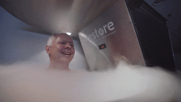
Good, clean, fun, professional photography was essential to elevate Restore’s brand. It can’t be phoned in.


Store Design and decor
With so many existing stores (franchise and corporate) nationwide and about five new stores opening each month, firmly establishing how they all should consistently look inside and out was a burning need. With so many stakeholders invested it was difficult to offer solutions that everyone agreed upon. After countless think tanks and design rounds, my creative team repeatedly had to go back to the drawing board. Buy-in was necessary yet difficult to obtain. It tested many wonderful people’s patience, but we prevailed and we were able achieve our goal. My vision was for a clean, uncluttered, elevated environment where customers could really relax. It was really about curation. Taking things away more, versus adding. When managers wanted flyers for their counters, we offered alternative solutions instead. From the contour cut vinyl messaging on the windows to the flooring, there’s a lot that went into every decision. This required a lot of incredible teamwork between the creative, construction, operations, and leadership teams. Thanks to everyone for its success.


Restore Labs
When I learned one of the goals of Restore Labs was to be one the leading test facilities in the world for Hyper Wellness services, I immediately saw in my mind’s eye that I wanted to see a huge scientific chalkboard filling the space when you walk in. I was too busy with my many responsibilities to design it myself (as was my team), so I commissioned my wife Jayme Austin to design it. She’s one of the best designers I know, and chalkboard art in venues all over Austin have been her specialty for years. She knocked out her mockup very quickly, then the both of us hand rendered her design over the course of many back to back all-nighters. The end result was even more impressive than I first envisioned.
